‘Private Eyes’ Spectator cover (and process)
Fresh off the press and on newsstands now. We missed the chance to do a Julia Gillard cover, as the story broke 10 minutes before printing deadline. I'm a fairly quick worker, but that's cutting it a little fine! So, instead The Spectator went with the latest artwork highlighting the McInnes scandal and the intrusion of the media into the private lives of our politicians and businesspeople.
Here is final art. Please scroll down to see a quick, simplified process for the illustration.
Final published cover, below
--
The Process
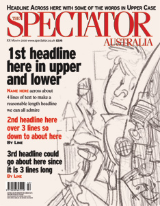
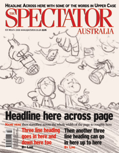
Thumbnails: these are quick roughs to give the editor an idea of what I have in mind. usually I send over only two or three, but for some unknown reason I sent six.
--
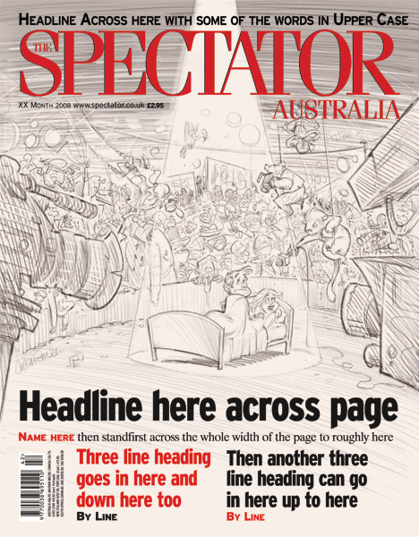
Sketches: First I start off with a rough sketch and make sure everything is working visually. I always work in the template, as it is vital to the composition with this sort of image.
Then I go over the rough and tighten everything up, adding some tonal values to get a better feel of the piece. Polished sketch is below:
--
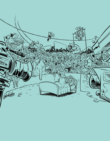
Inks and Colour (below) - I haven't detailed all the shading and subtle colour work that goes on between base colour and the final art. With this piece, it was all icing on the cake, as it looked pretty good even with the flat colours. I think this is a good sign, and I try not to overwork the colours too much. I added subtle colouring to the crowd, but it would have worked just fine in monotone as well.
Inked, and now I go over it quickly with some rough colour to make sure it's going to turn out like I see it in my mind (below).
Then I paint in flat colours so I can isolate the areas for shading and extra colour (below).
--
Finished art in temporary layout (below): I always try to work with the type/furniture on the illustration, as it can affect the composition. In the published art, the art department have erased the clown on the tightrope, most probably so as not to obscure the title, or they felt it cluttered it (or both).
Thanks for stopping by.
cheers,
Anton


