'Schmaltzed to Death' illustration
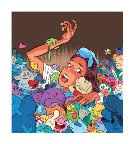
Here is a personal piece, titled Schmaltzed to Death. (Please click for a closer view)
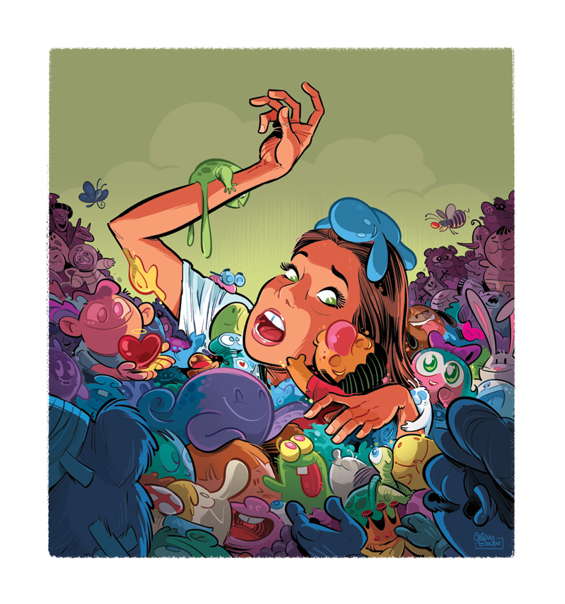
----
The Process
I originally started sketching it up for paper and ink, but halfway through I realised I could better achieve the look I was going for by doing it digitally, in Photoshop. My brush and ink is a lot looser these days, and I wanted to keep this a little tighter.
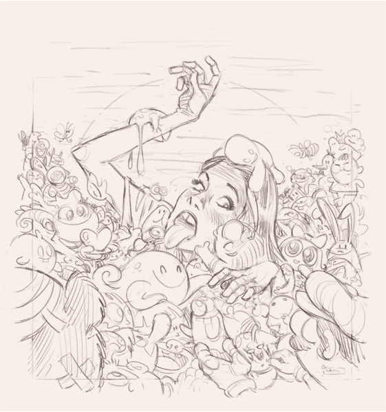
Roughs
I tried taking some photos of myself and my wife for head angle reference, but I just couldn't get the right look. I found this one online, which was pretty close, so I used that as a rough guide.
'Finished' sketch
Because this was just for me, I didn't refine it too much - just enough for enough detail to ink it properly.
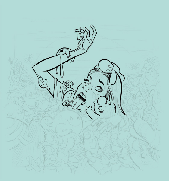
Inking
Well, digital 'ink', anyway! Still drawn the old-fashioned way - by hand - just using a Wacom Cintiq tablet display. I take the opacity of the sketch down and also add a blue/green background as a base. This is not only good for adding colours to a more neutral background, but is easier on the eyes when settling down for a few hours of inking. White screen can really burn into the eyes!
Colour Areas
Next I block in the rough areas to separate the planes. I do each on a separate layer, so I can Cmd-Click them to easily select that area later when adding more colour and shading.
My wife, Ash, also flagged the girl's tongue as looking a little strange. I agreed - it had niggled at me till then, so I revised it.
Base Colours
Next I carefully colour each element so I can use the Magic Wand tool in Photoshop to select the areas if need be. In this illustration, I actually wasted a little time by doing this, as I ended up going in and colouring without selection for the most part.
Colour work
At this stage I started playing around with colours. My initial vision for it was for a multi-coloured sea of cute characters (below), but it wasn't gelling.
I also tried a quick colour gradient (below), which was looking a bit better, but still not what I had in mind.
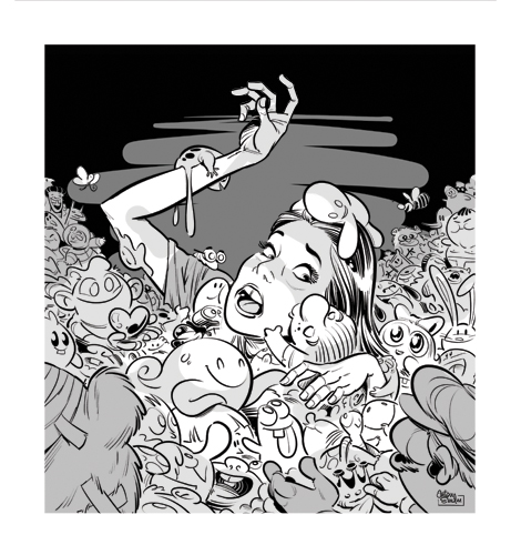
And then I thought that black and white would be better, so I gave that a go as well.
Colour crisis! Working freelance from my home studio is great, but you do miss out on interaction with fellow artists. Luckily, the internet makes things a lot easier, so I emailed the super-talented Dave Follett to ask for a bit of advice on the colouring.
Dave, like me was being a sad, sad person... drinking and drawing late on a Friday night, and he looked at these with fresh eyes, made a few quick adjustments and sent these suggestions back:
Dave's advice was to differentiate between the planes, and force the eye into the middle. He suggested that the last one (above) worked the best, and I tend to agree, but I felt like I was cheating on my original vision for the piece and struggled along trying to get the technicolour look to work. I ended up incorporating this theory into the next stage of the illustration.
I started by using his background colour suggestion (below), but I felt it made the illustration feel a little too dark. I wanted to keep it a little less sinister... well, as much as possible considering the ominous underglow and subject matter! It also felt a little claustrophobic - I wanted the scene to take place outdoors from some reason.
So I lightened up the background and made it a dull green (below). I also made the border weathered, but later changed this, too. I have also darkened the foreground to push your eye into the centre. I've also started to colour the linework on the characters to make them a little softer.
And below, the final art, again. I added clouds, made the glow a little more subtle (I used one of Chris Wahl's great brushes - straight hatching, I think) plus finessed the colour and shading, adding many small details.
Thanks for reading!


