Kwasi Studios Robot
Here's a character design for a web consulting company specialising in SEO. The brief was to create a character to go with the company's tagline "websites for robots & humans"; a cute robot that evoked an emotional response.

Development:
Roughs
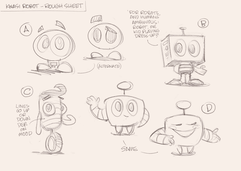
Here are a couple of rough sheets. The first (below) was just for me... I draw variations and play around with the character.
Then I knock out the weaker designs, leaving only the strongest for my client to choose from (below):
Sketches
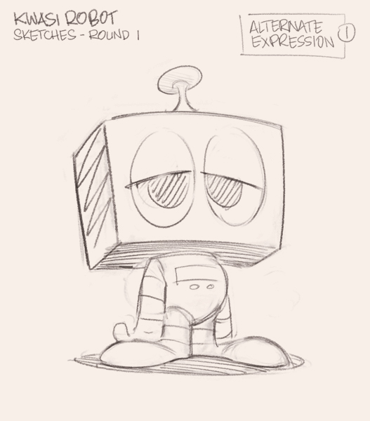
The client liked "B", so I refined the sketch:
But he also had mentioned that he may want to have him in a suit...
And to have a bit of fun, and show that our character was easily capable of more expressions, I offered up some alternative poses...
Colour Variations
With the approval to go to ink and colour, I did so, but we hadn't locked down the colours, so I offered up a few to choose from. The colour here is pretty tight, but not quite finished.
I supply these on white, grey, aqua, and black backgrounds, as the colours appear differently on each. A good colour combo should work well on each background.
Final Rendering
So we have agreed the "4B" works best, and I just need to bump up the blues a little...
...Done!
Logo Type
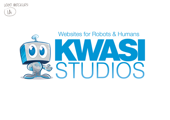
The other part of the job was to pair the character with some type for the logo. We agreed that the type should be simple, sans serif and should stand alone without the character if need be.
So I laid out some variations:
And the winner....
Thanks for stopping by, and be sure to head over to Kwasi Studios to check out the little guy in his natural state. They've also posted a very nice process post on the character development: www.kwasistudios.com/brand-identity-is-born/
Thanks for stopping by,
Anton
